Disc Designs
SUMMARY
The following design projects are connected to the sport of disc golf (it’s like golf, but with frisbees). The projects include:
1. Glow in the Park
2. Battle of the Bay
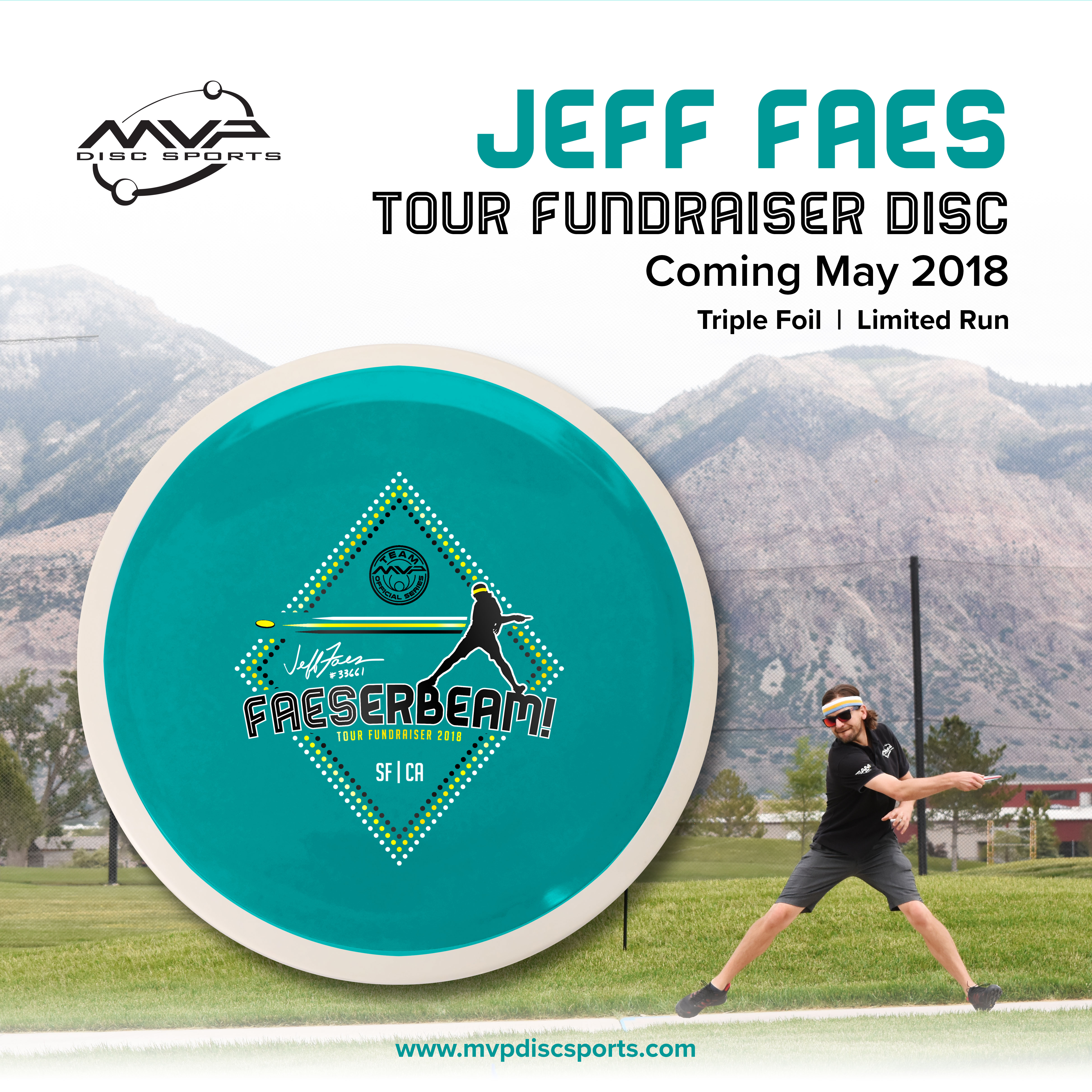
3. Faeserbeam Tour Series Disc
GLOW IN THE PARK
I was approached by the Tournament Directors for Glow in the Park to design production assets for their event. The client requested a one-color foil disc stamp design and matching graphics for social media promotion. The event was held in Golden Gate Park at night, featuring glow discs and colorful LED lights to turn the forest into a late night disc party and competition.
I wanted the disc stamp to capture the tournament environment: a fun party event under a peaceful night sky. I selected the display typeface Potra due to the “neon sign” appearance which plays into the glow theme of the event. The neon sign idea was expanded from the disc stamp into a full color poster layout for social media.


Before-and-after photo. Use the slider to see the original photo used for the event poster (Hole 13 at the Golden Gate Park Disc Golf Course). Through Photoshop edits, I changed the daytime photo into a moonlit night.
BATTLE OF THE BAY
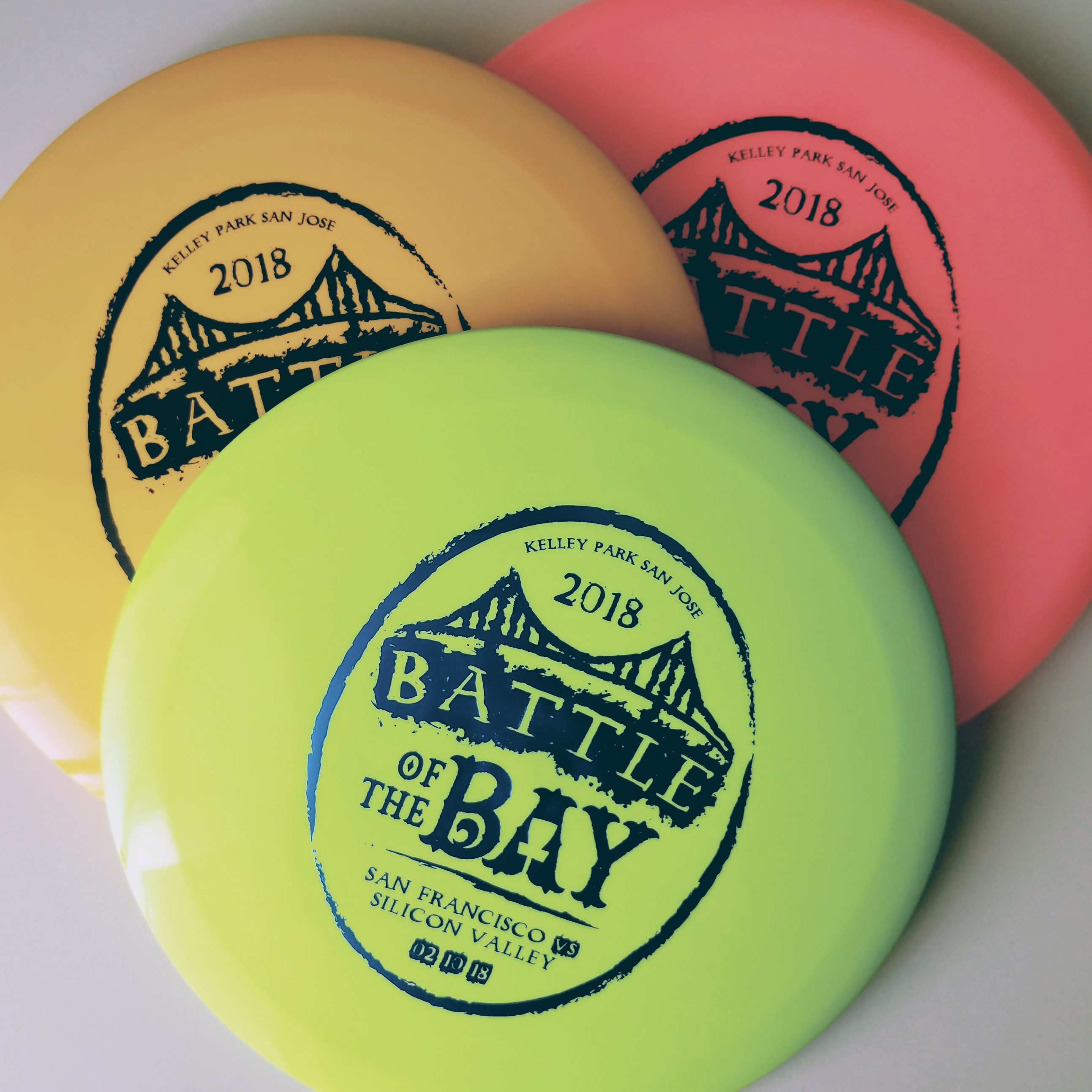
I was approached by the San Francisco Disc Golf Club and Silicon Valley Disc Golf Club to design the disc art for the first ever Battle of the Bay event to take place between the two clubs in February, 2018. The clients requested a one-color foil disc stamp design and matching graphics for social media promotion.
I chose to focus on the ‘battle’ language with a grungy aesthetic to evoke a rugged turf war between the competing clubs. The disc art was created in Adobe Illustrator, while the social media graphics were developed in Photoshop.
Discs were given to competitors at the event and sold as fundraisers.
I explored various type treatments for the title text. The typeface Bender was ultimately chosen due to its playful angles, high legibility, and for the opportunity to combine its inline and solid font options.
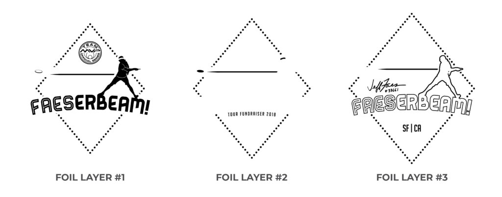
The design consists of three interlocking vector layers, each of which was used to produce a metal die for stamping a unique foil color.
The original design featured a solid player silhouette (left), which was approved by the manufacturer, but ultimately caused technical issues during the hotstamping process. The silhouette surface area was too large, trapping air bubbles that caused dropouts in the foil. I created revised versions of the silhouette (center and right) that included negative space areas for air bubbles to escape. The sleeve and hemline version (right) was included in the final stamp design.
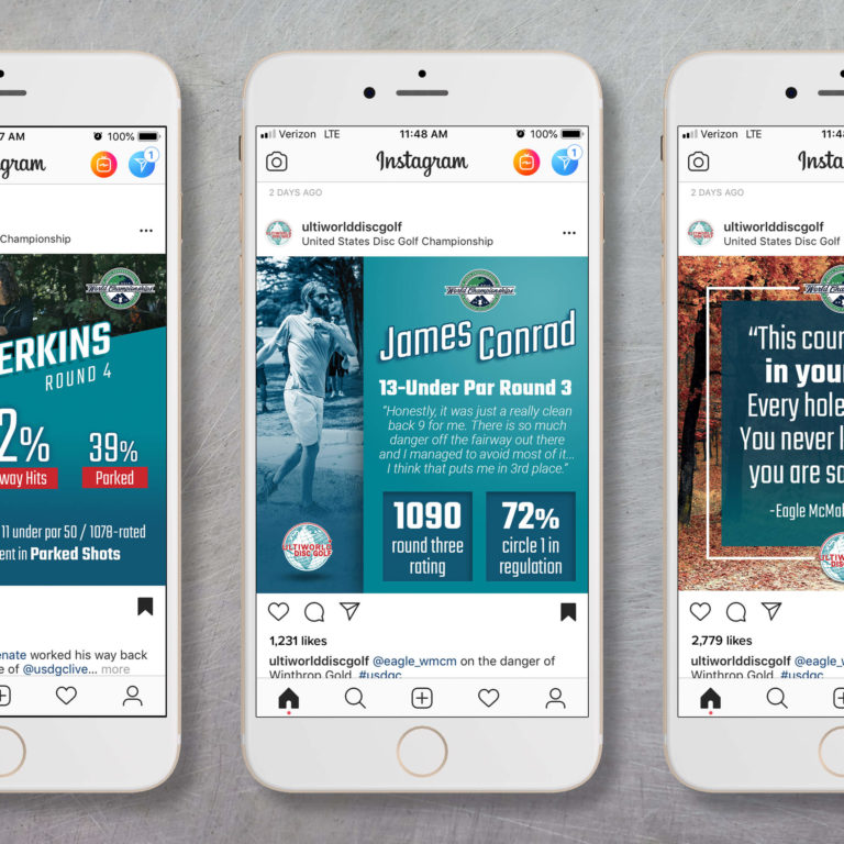
Social media promotional graphics (above) were created in Photoshop.


