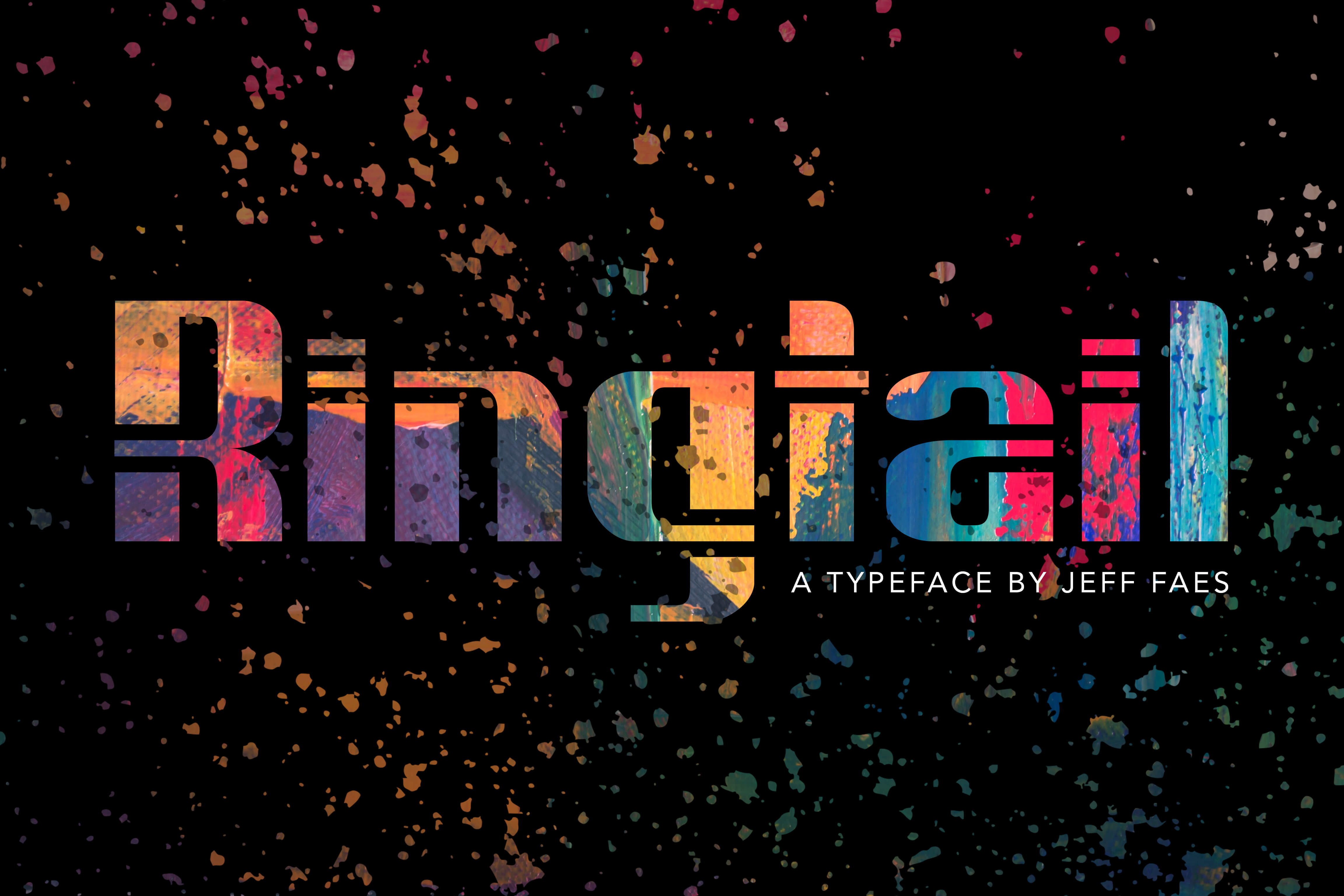
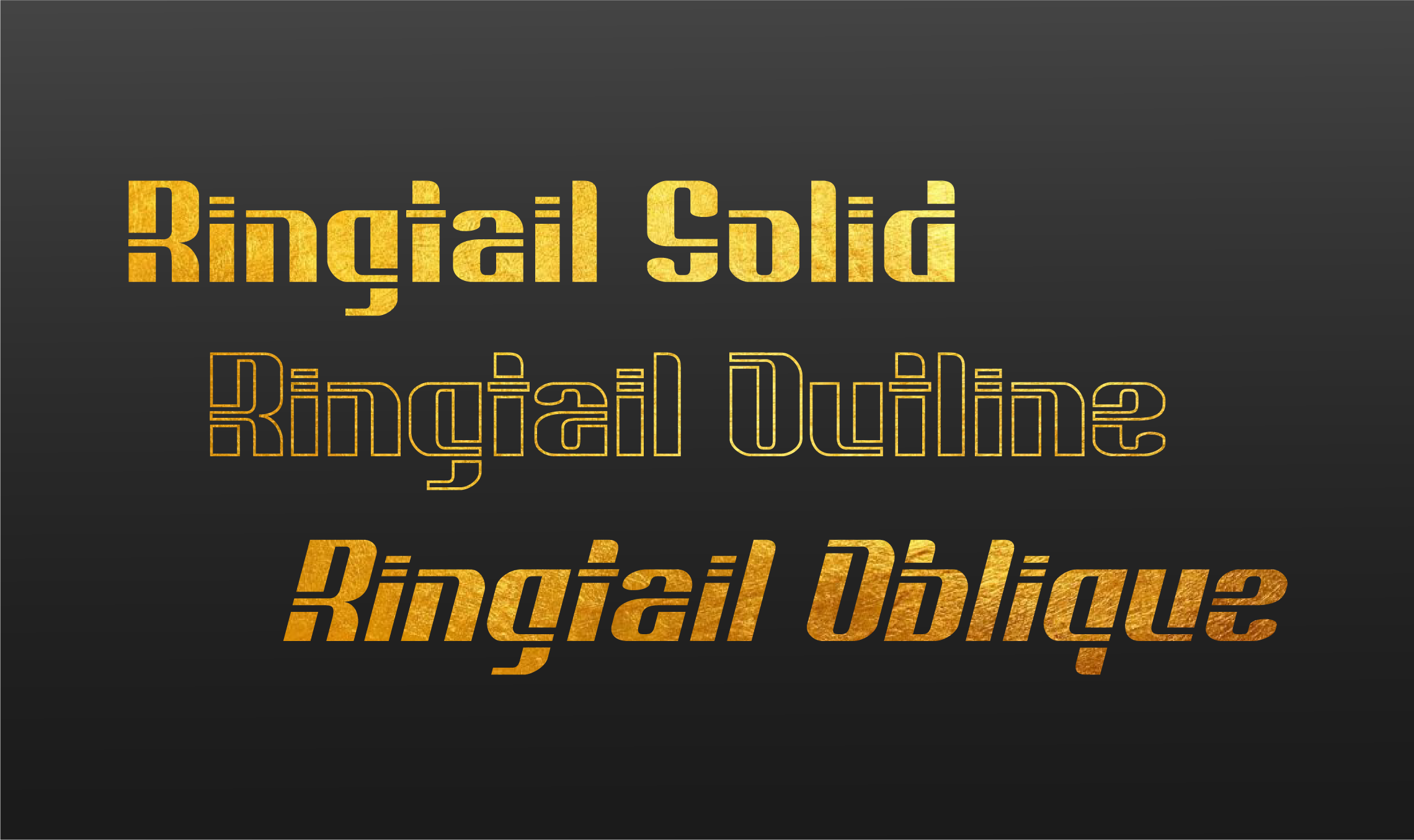
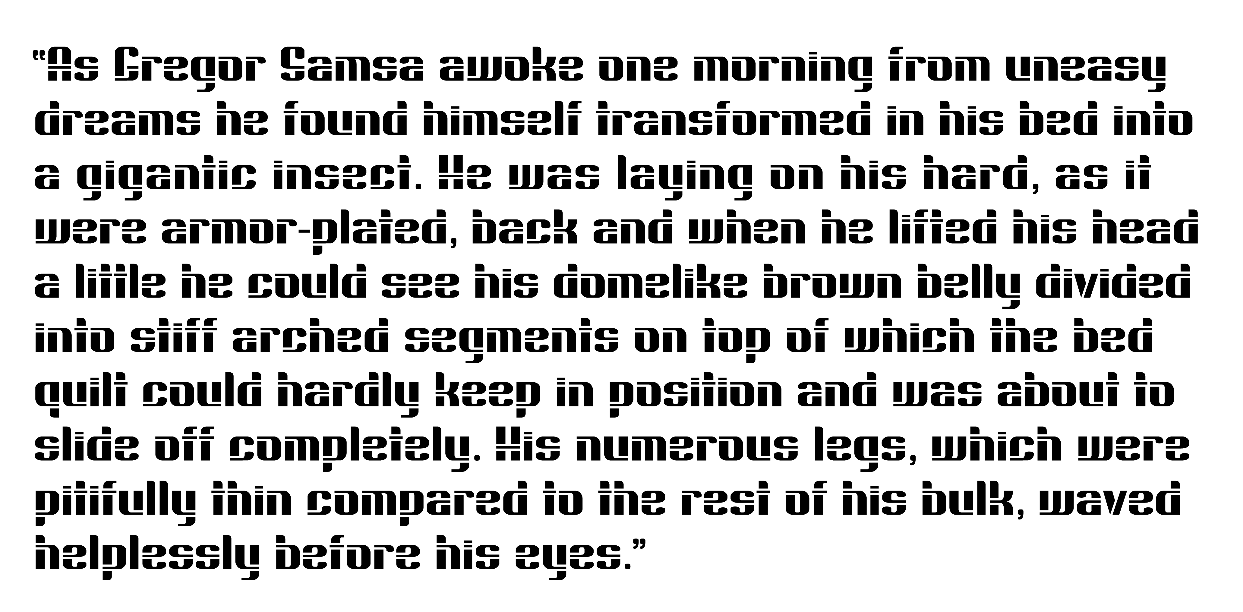
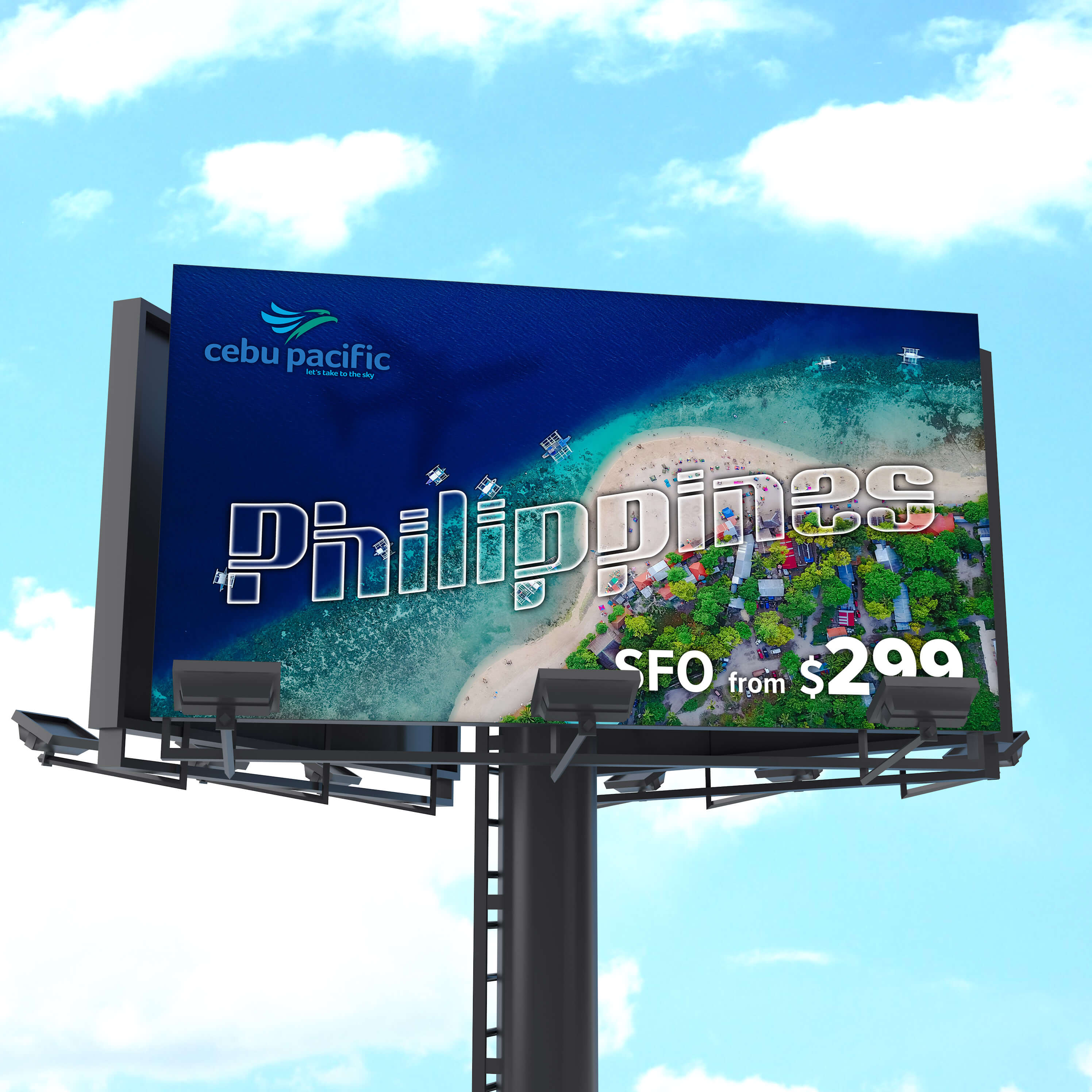
I designed Ringtail as a display typeface with connecting horizontal elements that create a unique combination of flow and tension across letterforms. While perfect for logotype, headlines, and bold, attention-grabbing poster titles, Ringtail also remains legible in small sizes.
CREATION PROCESS
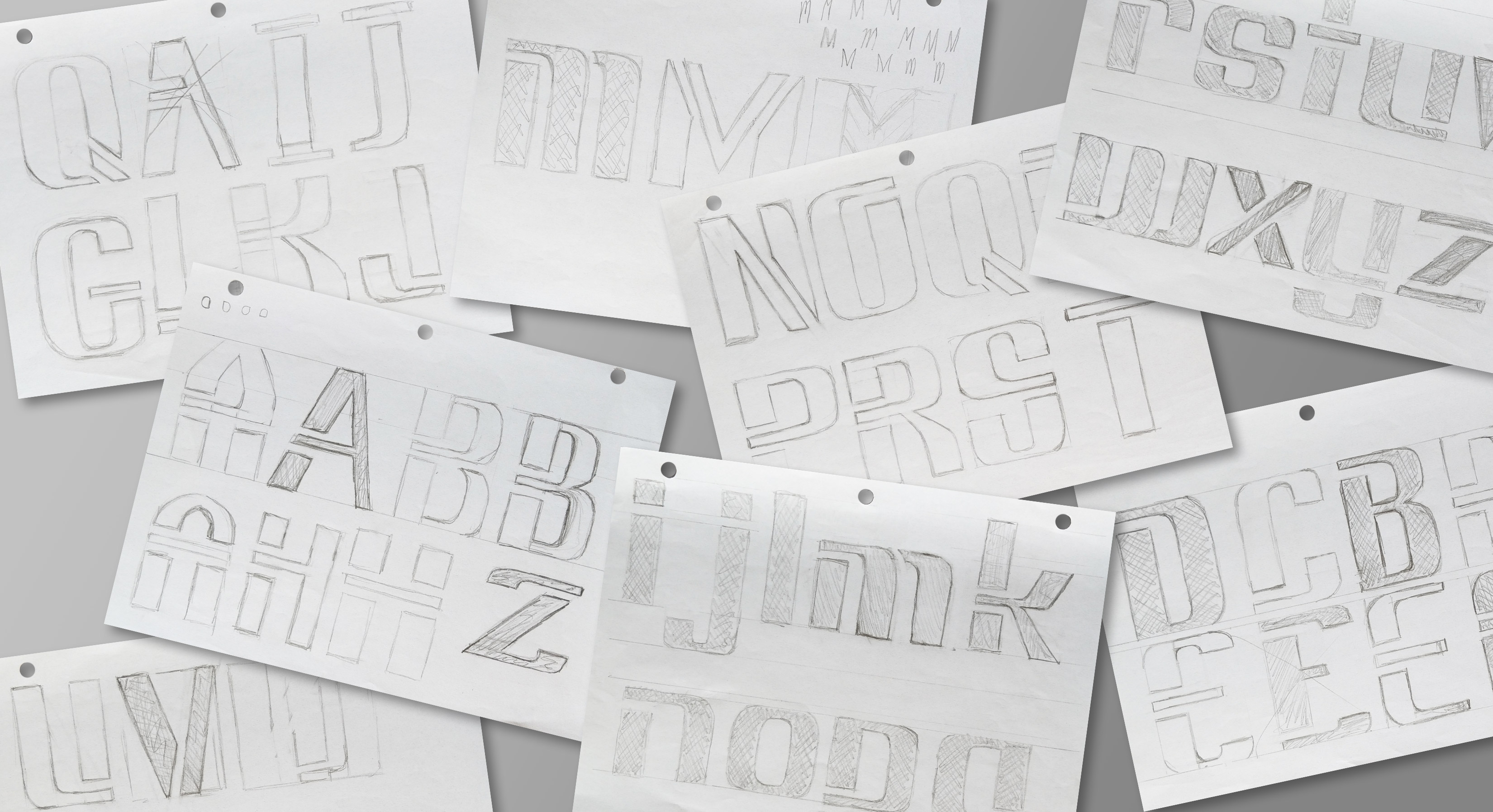
Early sketches focused on shared design elements to establish family consistency across each character.
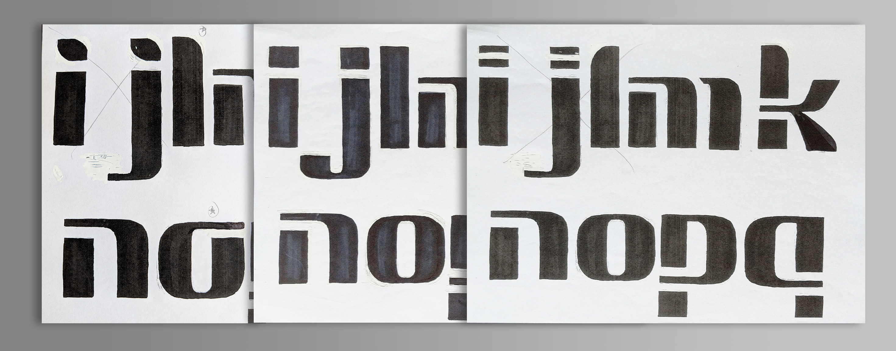
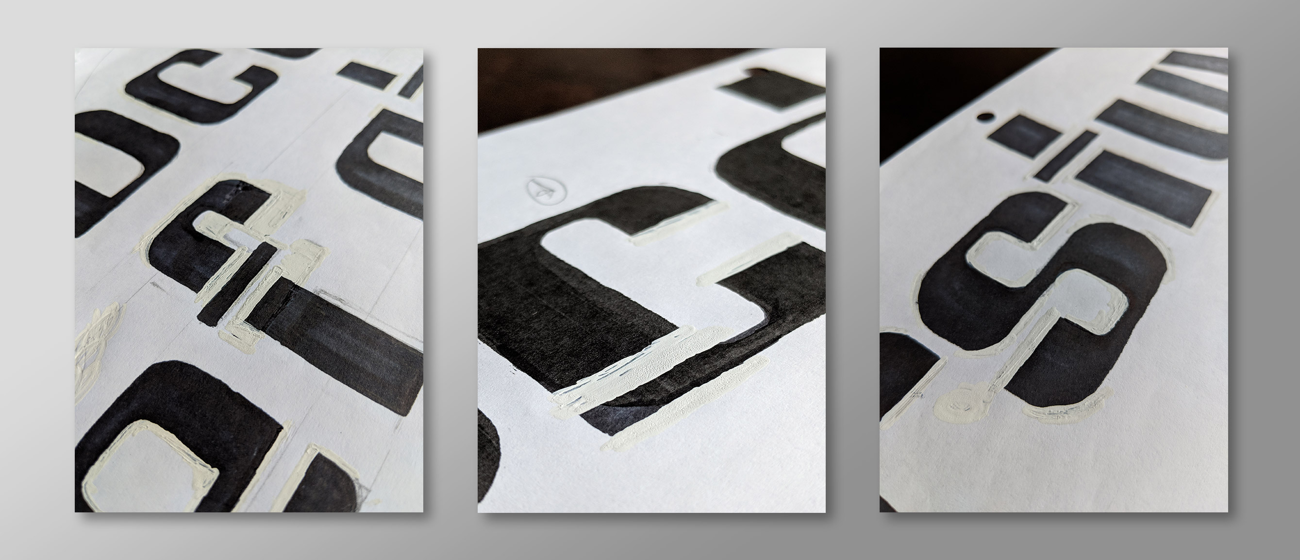
Typeface Evolution: Sketches were filled with black marker and modified using whiteout. The first draft was photocopied to allow for further experimentation with stroke and gap width. The modification process was repeated draft-by-draft until all letterforms were ready for conversion to vector shapes in Robofont software.
Detail of the letterform development process using marker and whiteout.
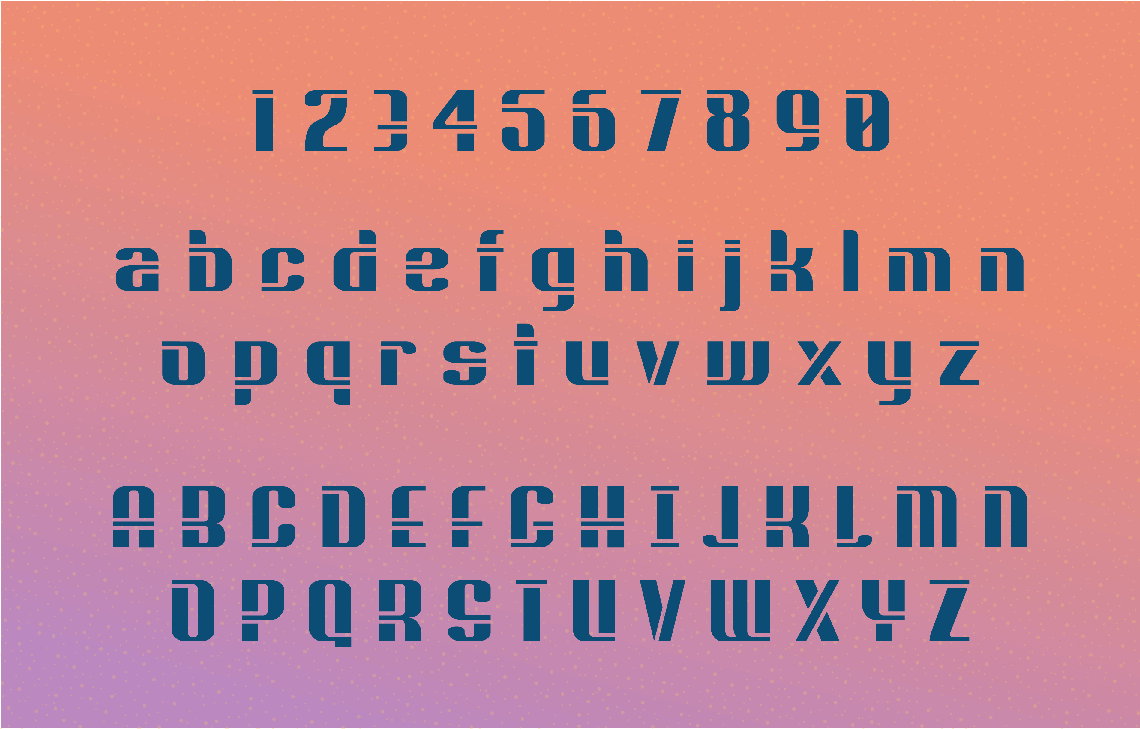
Final glyph set
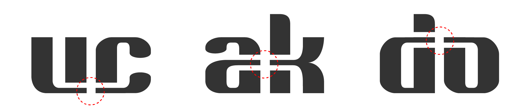
Three precise “connector” heights create dynamic letterform combinations
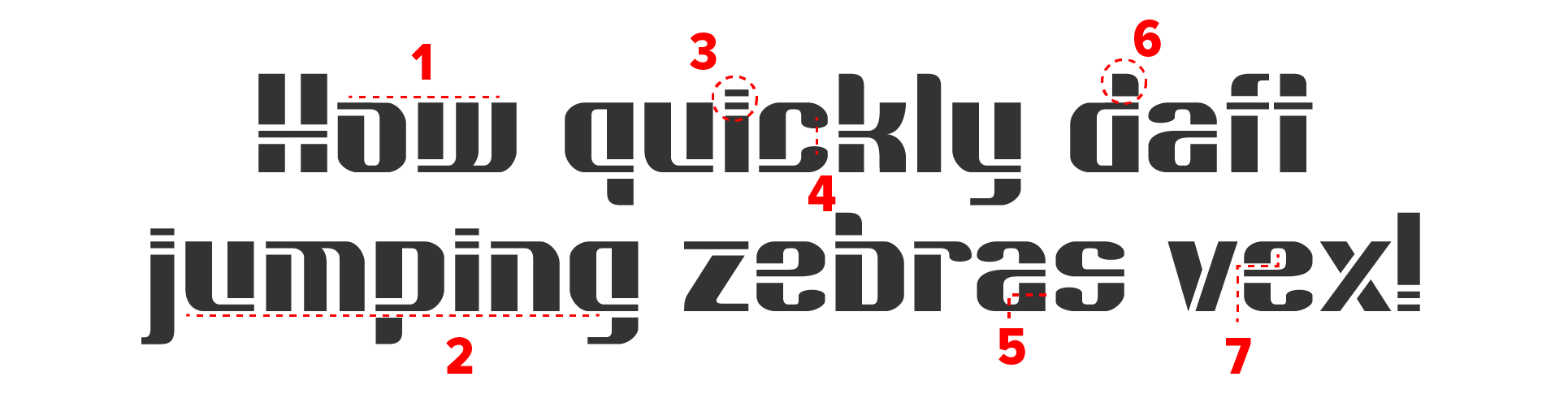
1. Moderate x-height 2. Letterforms emphasize a flat baseline, lending sturdiness 3. Stripe-dotted ‘i’ and ‘j’ 4. Closed apertures 5. High contrast stroke width 6. Curved, asymmetrical ascenders 7. No true counter-shapes – allows type to be “punched out” of solid materials
While not ideal for body text, Ringtail will remain legible in small sizes.